In this essay I am going to evaluate my music magazine, which consists of a front cover, contents page and a double page spread. We were given a brief which was; The front page, contents, and double page spread of a new music magazine. All images and text must be original, produced by you. Minimum of 4 images. For which I chose to do in a ‘Indie’ genre style. I developed my idea by looking at different magazines and genres and deciding on a genre that I thought there was a market for, I chose to do a female indie music magazine, because I found that there was a niche in the market for a female, orientated indie magazine, because many are based around a male audience. So it is original and therefore not mainstream, which links to my magazine’s ideology of the genre, because the readers, the people who represent the following, believe that they should be individual, and not follow the trends of the mainstream artists. I followed many of the conventions of music magazines, primarily ‘indie’. I followed the mundane conventions of a music magazine because I used a tagline and had the name of the magazine in the top left corner, and have the main article, in larger font and more in the middle of the front cover, to grab the readers attention directly. However, I broke conventions because the name of my magazine is not revealing in a way of, stating my magazine is in fact a music magazine. The name of my music magazine is relevant to the genre of my magazine, because being ‘Indie’ is, as mentioned earlier, about being individual and “your own person”. A more obscure connotation of the name of my magazine, is rare as in raw, like the music in my magazine, because it’s live and it’s all about how they sound live. The typewriter font was used because it is meant to be a contrast to the very feminine title font, because my magazine is for females and about being a female in a male driven society, the idea was for this ideology to be underlying moral, I did this because many of the magazines are aimed at men and are sometimes unsuitable for female readers because they portray female artists in a more promiscuous manner so I wanted to create a magazine for females in a male driven society, to enjoy fashion and music together in my Magazine. Alternatively, my magazine has an old newspaper theme and I felt that this font, would in fact accompany the background well.
My music magazine, represents the social group which is female students, which is the social economic group E, These are interested in fashion, and having their own unique style, and so I represented that by having a more fashion poses within my magazine. Furthermore, also Many students are into the genre of music that my magazine is based upon. The ear that I used on my front cover, was a backstage meeting with an upcoming band who are becoming more and more known, so students are more likely to know about them because being in the biggest consumers of music today, and also the opportunity to meet them and to make music together is a big opportunity young people because obviously celebrities are their inspiration and idols. I feel this represents my audience well because it gives them the opportunity to meet and greet someone famous, which may be something that many of the young females who may read my magazine, may want to become famous artists in the future and because the music is something they are interested in, it will be an incentive to buy the because it is a band who is directly associated with the genre. Because my music magazine is for Students I chose to price my magazine at £1.25 because it is cheap, which is ideal for those who have little or no income.
The institution that might distribute my media product is probably, Spin magazine, a magazine I used to analyse front covers, this is because they use the same alternative music and in many of their covers use the sepia tone, and also when a female appears on their cover they use a more fashion pose, opposed to a conventional music magazine pose. I also believe that my music magazine, has many of the ideologies as this magazine, however because mine is aimed specifically for females, some of my ideologies are different to this magazine. Also because Spin is a “Indie” magazine, they may also be interested in the concept of being a music magazine aimed at females, because this is something that is not around at the moment so it would be an individual concept, which they may visualize my idea as another way to go against the mainstream magazines, by offering females, the option for an entirely female based magazine.
My audience profiles, are female students, aged about 16-25, whom are interested in fashion, and like to follow fashion as well as music, because they believe they both are extremely important together, as well as separately. They also like to listen and attend live music shows and festivals regularly, they also like to attend social events, and are heavily influenced by music and fashion of older generations, such as the generations of Paul Weller and Oasis. My audience is also people that believe that you should become the person you wish to be, not what everyone around you wants you to be, and to achieve this they, as stated in the previous statement, use older influences, and also a rage of different styles to create their own identity. Yet that said, my audience prefer acoustic and guitar based music, which is the style of music I included in my magazine.
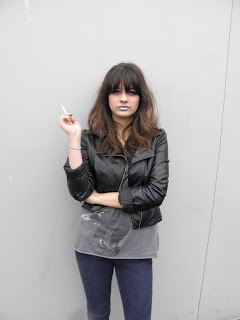
I chose the “Indie” theme because I like the black text and the gold colours together, also I like the ideology that can be portrayed with the “Indie” genre. Furthermore, the music and style of dress is very popular with students, I have noticed that is also particularly popular with female students, and once I noticed this, I realised that many of the music magazines are aimed initially at males opposed to females, and yet females, consume just as much music as males, so therefore, I decided to create a music magazine for female students. I used different poses that would undoubtedly be seen as unusual, which I used because this would in turn create a lot of attention because potential readers would be curious as to what my magazine could possibly include, to reinforce this I chose to use a name that did not directly tell the potential readers that my magazine is in fact a music magazine, however the connotations of my title, mentioned in a previous paragraph, relate directly to the genre of my music magazine. I used a sepia colour because this creates a sense of age, which relates to my magazine because the followers of my genre, use inspiration from older generations of fashion and music, also mentioned in the prior paragraph, also this colour is associated with my genre. I chose to used a golden glow around the main feature title, to create attention to it and make it stand out, so the first this a reader would see is the glow and then read it and hopefully this will then attract his/her attention and make them want to read the article, also for this reason, I put and ear in the top right hand corner, I chose this position because when the magazines are stacked in a newsagents, the magazines are overlapped and only the right-hand side is exposed, and so the ear will then be the first thing you as the reader, will see and it draws you’re attention because it is a brighter colour and a explosion shape.
I used photoshop and I found that I am able to fade out writing with ease, by using the rectangle tool, also I can use the outer glow burn and emboss, to create a more professional looking title, however when I wanted to recreate this on the contents page I found this difficult, because I could not remember how I made my title look that way, when I came to creating my contents page. I also found that I can use outerglow in a lighter colour to create attention for the features on my magazine and use the noise tool to make this appear more ragged and fit in more with my magazine colours, however it also if too much noise is used, it is capable to make the glow make the text difficult to read. The shadow, means I can create the shadow underneath my ear, and this helps again to create a well executed front cover, and also attract attention to the ear because it appears to “pop” out to the reader. The lights I used to do my pictures with, gave a nice light onto my model, this is because they were able to make the background look sepia using shadows, rather then effects.
I feel, looking back at my preliminary task, that I have progressed because my magazine looks more professional, and I used a better camera which meant that the picture quality was improved which then meant, the standard of my magazine improved also. Also my title is much better and stands out much more and in turn compliments the content of my magazine. Furthermore, I feel that my name was also better thought out, than with my college magazine. Also because I had more experience with Photoshop, which meant I was then able to create a better standard for my magazine. Also I was able to identify the general conventions from the college magazines and transfer them on to my music magazine, which was what I did, I feel I did not defy the conventions as much as I feel I could have done, however, I feel that my music magazine is good even with these conventions because it defies them in other ways as I stated in the beginning. Overall I feel that my magazine is good for the style of genre it is however, I feel that in sections of my magazine there is room for improvements.


