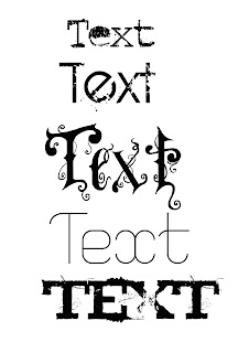
The text i am going to use for my music magazine is the second one, as it is bold, but also edgy and attractive. I feel out of all of them it's the easiest to read and fits in with my genre as well as being bold to caputure the audiences attention.
the third and last one, are very difficult to read and would therefore would not be good to have one a front cover or as title fonts.
The fourth one, is not bold enough for it to make enough of an impact on the audience.
The very first one, is too small and would not be as "in your face" as i would like it to be.

No comments:
Post a Comment