^I liked this photo because of the lighting and
the way that the model is in amid action shot,
and it refers to the live music that my magazine is all about and so i will use this somewhere in my magazine.
^^^This Picture was too dark and you couldn't see my artist.
^^ The facial expression was not how I wanted it.
^^ Jacket was in the shot.
^^ Didn't like this angle.
^^ Too dark again.
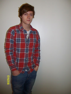
^^ The date on the wall, hard to photoshop out,
and for the end result to look
Professional.
^^ No room at the top for magazine title.
^^ I like the alternative pose and therefore
will use this one.
^^ I like the sepia effect, but is horizontal.
^^ Too much room around her.
^^ Too dark, the artist is in too much
shade.
^^ I like this one I'm going to use it.
^^ I like this one also because
I like the tone and the wheel covering her face
and I may use it.
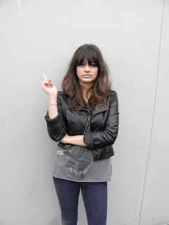
I didn't use these below because I thought that The fact she was smoking, is not a good image.
^^ However I did like this Photo, I just
decided that having my artist
smoking was not the image I wanted
to portray.
^^ I also liked how this picture can out.
^^ I liked this one also but the light is
too bright and should maybe be in
black and white or sepia.
^^ Too much out of focus.
^^ Too out of focus.
^^ Out of focus and can see the floor.


No comments:
Post a Comment